Designing Loading in Product UIs: Spinners vs Skeletons vs Optimistic UI (When Each Is Right)
Loading is a UX surface. People don’t rage at “waiting” as much as they rage at uncertainty.
If you want your UI to feel calm, fast, and expensive, pick the loading pattern that answers the user’s real question in that moment: Did it register? Is it working? Am I safe to keep going?
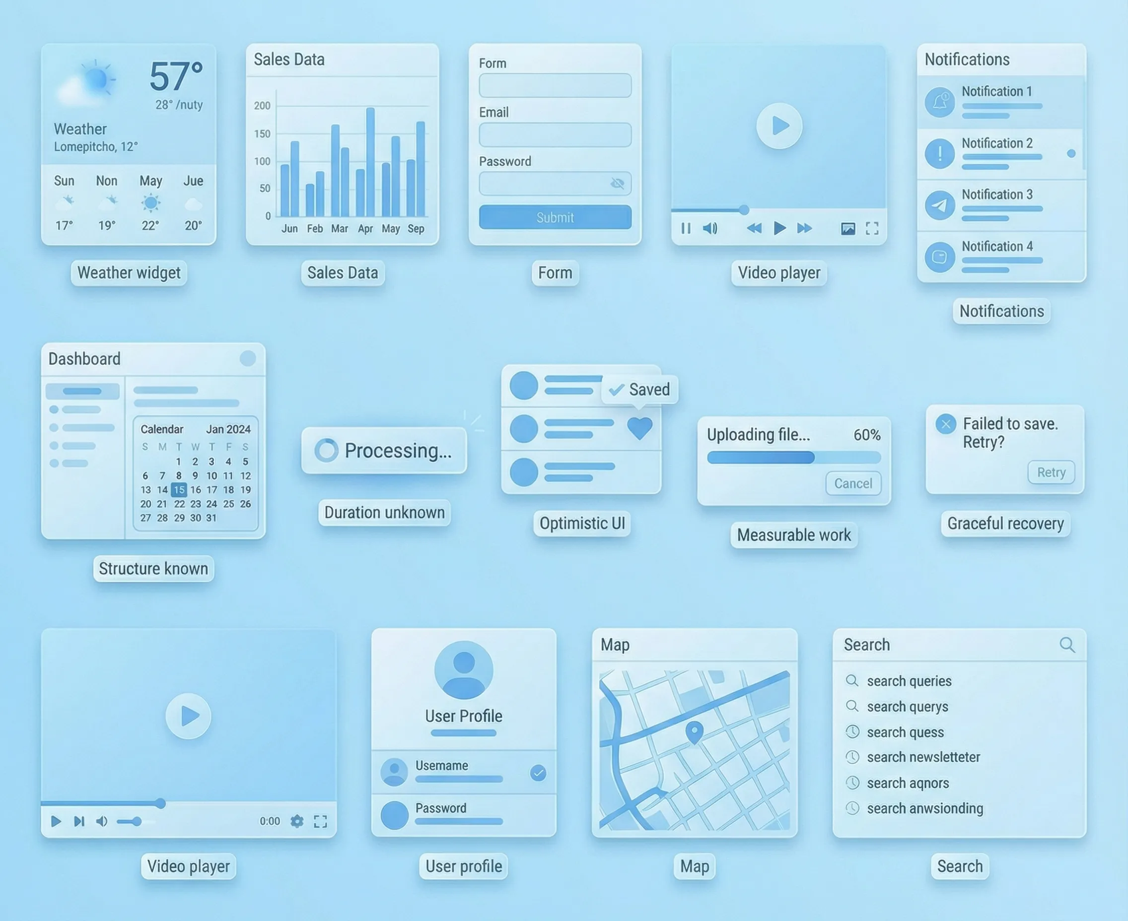
The 4-variable decision (use this every time)
- Duration: instant, short, long
- Predictability: do we know what will show up (shape) and roughly when?
- Risk: what’s the cost if we’re wrong (or the request fails)?
- Layout stability: do users need the page to stay anchored so they can keep thinking?
Scenario map (defaults you can standardize)
On most teams, the hard part isn’t picking a pattern once—it’s picking it consistently. Here are strong defaults for common UI moments:
First load of a dashboard: Skeletons. When the structure is known, skeletons reduce “blank page” anxiety. Keep the layout true-to-life—don’t shift columns/widgets when data arrives.
Refreshing a table after filters: keep existing data visible, show Updating…, and use a partial skeleton for the region that’s changing. This preserves context and avoids a full wipe—avoid full-page loaders for one region.
Searching in a list: keep old results visible, show an inline spinner, and surface Searching…. This prevents flicker and confirms input registered. Consider debouncing and a strong “No results” state.
Infinite scroll (load more): use an inline spinner at the list bottom. It localizes waiting to the action. Don’t block scrolling, and keep scroll position stable.
Toggling a setting: Optimistic UI. Intent is clear and reversible, so reflect the new state immediately. Add a pending/syncing state and rollback on failure.
Starring/saving/liking: Optimistic UI. Low risk and high feedback value. If offline, show a queued state and reconcile later.
Creating an item in a list: use an optimistic placeholder row/card. It maintains momentum and reduces “did it happen?” anxiety. Reconcile the real ID and handle server errors without losing the item.
Uploading files: Progress bar. The work is measurable—include Cancel and show per-file failures.
Bulk import / long job: Stepper + progress + status. This sets expectations and reduces panic. “Validating → Applying → Done” beats a spinner.
Destructive action (delete): use an explicit processing state (spinner + clear status) and offer Undo when possible. Risk is high—don’t pretend it already happened. If undo isn’t possible, be explicit.
Payments / permission changes: use explicit processing states (spinner + clear status). Risk is high and optimistic UI can create trust debt—prefer “Processing…” with a clear success/failure result.
Spinners: best for “something’s happening, duration unknown”
Spinners are honest when you truly can’t predict what’s next.
Where they shine in product UIs:
- auth/SSO handoffs
- permission checks before revealing gated UI
- small background refreshes (badge counts, sync indicators)
The premium version is almost always inline (button-level or region-level), not a full-page takeover. Full-page loaders are a last resort—because they erase context and make users feel “stuck.”
Skeletons: best when the layout is known and context matters
Skeletons work because they answer: where am I, and what’s coming?
They’re great for:
- dashboards (widgets)
- tables (rows/columns)
- feeds/inboxes (list items)
Skeletons backfire when they lie:
- the skeleton layout doesn’t match real content (jumps when loaded)
- shimmer is louder than the UI
- placeholders persist too long with no explanation
If the user already has data on screen and you’re refreshing, consider keeping the current data visible with a subtle Updating… state. It feels calmer than wiping everything into a skeleton again.
Optimistic UI: best when the cost of being wrong is low
Optimistic UI says: we believe you. It’s premium when:
- intent is obvious (toggle, star, tag)
- rollback is easy (undo, revert, retry)
- conflicts are handled gracefully
Optimistic UI is not “pretend the server doesn’t exist.” It’s “move immediately, reconcile quietly.” That means you still need a pending/syncing state and a plan for failure.
Avoid optimistic UI when:
- the action is irreversible or regulated
- the system state is shared and conflict-heavy (inventory, permissions, money)
- being wrong would feel like betrayal
Progress indicators: use them when the work is measurable
If you can measure it, show it. If you can’t, don’t fake it.
Use progress (bar or stepper) for:
- uploads/downloads
- imports
- generation jobs (reports, exports)
- multi-step pipelines (validate → apply → finish)
The premium trick: name the phase. “Validating…” reduces uncertainty more than “Loading…”
Errors: the moment your UX either becomes premium or cheap
People don’t judge you by whether errors exist. They judge you by how you recover.
Premium error handling in UIs:
- keeps the user’s context (don’t reset forms, scroll, filters)
- says what happened in plain language
- offers a single next step (retry / undo / edit / contact)
If an optimistic update fails, either:
- revert with an explanation, or
- keep the state but mark it clearly as not synced and offer retry
Accessibility & motion (don’t let loading break the interface)
- Don’t steal focus when loading starts or finishes.
- Make status changes perceivable without relying only on motion or color.
- Reduced motion users shouldn’t be punished with aggressive shimmer.
Conclusion
Spinners, skeletons, and optimistic UI aren’t aesthetic choices. They’re trust choices.
Pick the pattern that best reduces uncertainty for that exact moment, keep layouts stable, and make recovery graceful. Do that consistently across your tables, dashboards, search, settings, and jobs—and your product starts to feel effortless in a way users can’t quite name (but they’ll absolutely feel).