Microinteractions That Feel Premium (Without Getting Slow)
Premium isn’t more animation. Premium is confidence: every tap, click, and change in the interface feels acknowledged, intentional, and calm.
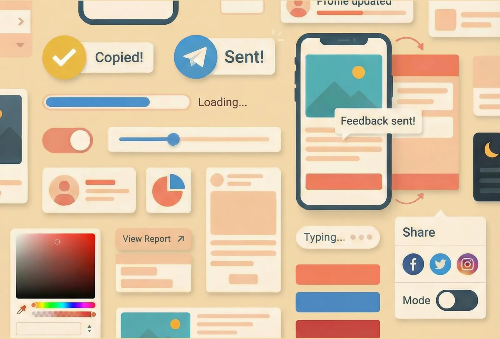
Microinteractions are the tiny moments that create that confidence—button states, inline validation, “Copied” feedback, progress indicators, subtle transitions. Done well, they make a product feel polished. Done badly, they make it feel laggy, noisy, or weirdly fragile.
This post is a practical guide for UX designers who want microinteractions that feel expensive—without paying for them in performance.
Premium starts with certainty
Users don’t experience your UI as “screens.” They experience it as a series of questions:
- Did my click register?
- Is it working?
- Did it succeed?
- If it failed, what now?
- What changed, and where did it go?
A premium microinteraction is one that answers those questions quickly, consistently, and without drama.
1. Treat states like part of the design (because they are)
Most interactions feel cheap for one reason: the UI only has a default state. Maybe hover. Everything else is a surprise.
A real component needs a real state story: default, hover, focus, active/pressed, disabled, loading, success, error. That sounds like implementation detail, but it’s actually the difference between “slick” and “sketchy.”
When you map states up front, you stop designing the happy path only. And users can feel that. The UI becomes predictable.
A simple check: if you can’t describe what the UI looks like during loading and error for your primary actions, that experience is currently undefined—even if it “works.”
2. Make feedback instant—even if the system isn’t
People will wait. They just don’t want to wonder.
Your interface should respond immediately to an interaction with some sign of life: a pressed state, a label change, a spinner, a progress bar, a subtle state shift. The goal isn’t to entertain; it’s to confirm the action was received.
If you’re dealing with async actions, the premium move is not “animate more.” It’s to avoid dead clicks and repeat clicks:
- Acknowledge the action right away.
- Show “working” clearly.
- Make the end state unambiguous.
If nothing changes for a beat, users don’t assume “it’s processing.” They assume “it didn’t work,” and they try again.
3. Use motion to explain change, not to decorate it
Motion feels premium when it makes change legible.
Great motion answers “what just happened?”
- An expandable section opens in a way that makes its source obvious.
- A panel slides in from where it logically lives.
- A reordering list preserves object permanence so users can track items.
Bad motion is motion that competes with reading, delays input, or exists without meaning. If the transition doesn’t clarify the change, it’s just spending attention.
A useful design question: if the motion were removed, would the UI still be understandable? If not, the motion is doing a job (good). If yes, the motion is optional (fine)—but keep it restrained.
4. “Cheap” animation can look expensive (and expensive animation can look cheap)
You don’t need to be a performance engineer to design performance-friendly microinteractions. You just need to avoid patterns that create jank.
In practice, “premium” often comes from being conservative:
- Fewer moving parts
- Smaller distances
- Shorter durations
- Less visual noise (especially on scroll)
When motion is subtle and consistent, it reads as intentional. When motion is heavy, it reads as “trying.”
If you want a premium feel, bias toward interactions that never block the next action. The UI should feel like it’s keeping up with the user, not performing at them.
5. Reduced motion users still deserve a premium experience
A product that only feels good when it moves is a product with a single mode of clarity.
Design reduced-motion behavior as a first-class variant. The goal isn’t to make the interface “boring”; it’s to shift the feedback to other channels:
- Clear state changes
- Stable layout
- Crisp microcopy
- Obvious focus and selection
If motion is removed and the UI becomes confusing, it means motion is compensating for unclear structure. Fix the structure, then bring motion back where it truly helps.
6. Microcopy is part of the microinteraction
The fastest way to make an interaction feel cheap is vague feedback.
“Success” is vague. “Saved” is clear. “Something went wrong” is vague. “Couldn’t save—check your connection and try again” is clear.
Premium microcopy is:
- Specific (what happened?)
- Calm (no blame, no panic)
- Actionable (what can the user do next?)
Microcopy is also a trust signal. When you tell users what’s happening, they stop second-guessing the interface.
7. Accessibility is not a checklist item—it’s the polish
You can have beautiful motion and still ship an interaction that feels broken if keyboard and focus aren’t treated as real.
A premium interaction has parity:
- Focus is visible and intentional, not an afterthought.
- Keyboard flows match pointer flows.
- Status changes aren’t “visual only” (users still get confirmation).
Designers often think of accessibility as constraints. In practice, it’s one of the clearest markers of quality. When the UI behaves correctly across input modes, it feels solid.
A fast way to review your microinteractions
If you want a quick internal standard for “premium,” review key flows with these lenses:
- Is there a clear state for “working,” “done,” and “failed”?
- Does the interface respond immediately to input?
- Does motion clarify change—or compete with content?
- Does the experience still make sense with reduced motion?
- Are focus, keyboard, and feedback treated as first-class?
Conclusion
Premium microinteractions aren’t about flair. They’re about certainty. When you design the full state story, give immediate feedback, use motion only when it explains change, and treat microcopy and accessibility as part of the interaction, the UI starts to feel effortless.
And the best part is that this kind of premium doesn’t cost you performance—because it’s built on clarity, not complexity.