UX Simple: 7 Choices That Make a Site Feel Effortless
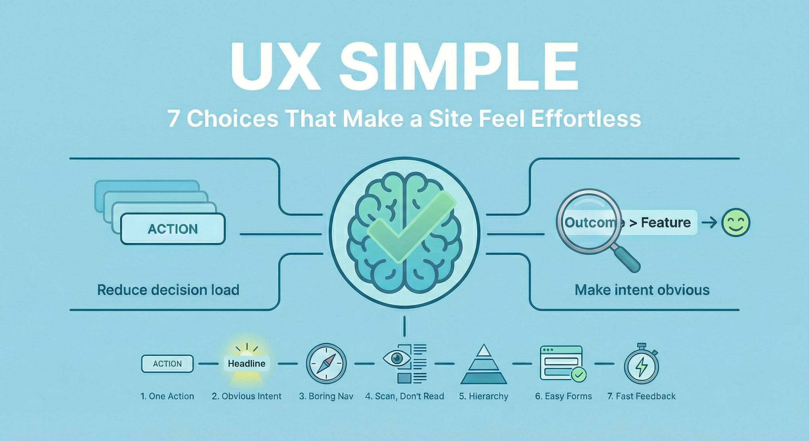
“Effortless” isn’t a vibe. It’s what happens when you reduce decisions, make intent obvious, and give fast feedback.
Below are 7 choices you can audit quickly. Each one includes a single source link so you can go deeper if you like what you see!
1. Reduce decision load: one primary action per screen
Every extra “option” is a tiny tax on the user’s brain. Your job is to make the next step feel inevitable.
Do this
- Choose one primary action per page/section (book, buy, sign up, read).
- Demote everything else (secondary links aren’t illegal, just quieter).
- If it’s not part of the page’s job, move it elsewhere.
Quick audit
- If you removed all buttons but one, would the page still work?
- Do users have to compare options before they can move forward?
Source
2. Make intent obvious fast: clarity beats clever
If your headline needs explaining, it’s not doing its job.
Do this
- Lead with who it’s for + what outcome they get.
- Use the next line for proof/context (constraints, differentiator, result).
- Make the CTA a verb a human can picture (not “Learn More”).
Quick audit
- Can a UX designer outside your org summarize the page in one sentence?
- Are you naming outcomes, or listing features?
Source
3. Navigation should feel boring (predictability is a feature)
Users don’t come to admire your navigation concept. They come to get somewhere.
Do this
- Use familiar labels (“Work”, “Pricing”, “About”, “Contact”).
- Keep top-level nav short and stable (no surprise reordering).
- Make “Contact” obvious and reachable from anywhere.
Quick audit
- Can users predict what’s behind each label without clicking?
- Are there multiple routes to the same place with different names?
Source
4. Design for scanning, not reading
People don’t read web pages. They hunt.
Do this
- Put meaning in headings (not “Our Approach”, but “How We Reduce Checkout Drop-Off”).
- Front-load the first 3–6 words of bullets.
- Use short paragraphs and real subheads (structure is UX).
Quick audit
- Read only headings: do you still get the story?
- Can someone find pricing/requirements/steps in under 10 seconds?
Source
5. Use hierarchy + grouping to route attention
If everything is “important,” nothing is. Hierarchy is how you guide.
Do this
- One focal point per section (one dominant headline/image/CTA).
- Group related items tightly (spacing communicates relationships).
- Make contrast do work: size, weight, color, whitespace.
Quick audit
- Squint test: what’s the first thing you notice? The second?
- Are “related” elements visually closer than unrelated ones?
Source
6. Forms: remove friction, add reassurance
Forms are where “nice site” turns into “I give you my data.” Treat them like a trust moment.
Do this
- Use labels (placeholders are not labels).
- Keep fields minimal; ask only what you truly need now.
- Make errors specific and fixable (and keep input values).
Quick audit
- Can it be completed one-handed on mobile?
- Does the user know what happens after they press submit?
Source
7. Perceived performance: feedback instantly, load progressively
People forgive waiting. They don’t forgive nothing happening.
Do this
- Every tap/click should get immediate feedback (state change, spinner, skeleton, optimistic UI where safe).
- Load what matters first (content before decoration).
- Avoid layout shift that makes the interface feel “wobbly.”
Quick audit
- Does the UI respond in under ~100ms for direct interactions?
- Do users see meaningful progress in the first second?
Source
Conclusion
If you want a site to feel effortless, don’t start with trends—start with friction. Make the next step obvious, keep navigation predictable, write for scanning, use hierarchy to guide attention, and treat forms and feedback like the trust moments they are. These seven choices aren’t “nice-to-haves”; they’re the difference between a user who flows and a user who bounces. Run a 15‑minute audit, pick two fixes, ship them, and measure what changes—because simple UX isn’t minimal design, it’s momentum.